Here's the video link to SaveTheWAVE's testing footage. Hope this works.
https://photos.app.goo.gl/WsZFrMR9oVsqzYb49
|
||||||||||||||||||
|---|---|---|---|---|---|---|---|---|---|---|---|---|---|---|---|---|---|---|
|
|
Maxx Force NEW FOR 2019
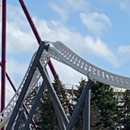
It worked. Something is telling me that it's supposed to be sluggish at the top of the double inversion(dog lick element). That launch looks pretty scary if I'm going to be honest. Seems as if it is pretty close to full speed.
Sent from my SM-G970U1 using Tapatalk
I don't think it looks 'slow' at the top. I didn't think it would be especially fast up there to begin with. Look at Top Thrill Dragster, it often looks slow up there or as if it may even rollback when it doesn't. Look at videos of many current launch coasters and they don't seem fast at the top of the hill when looking up at it from the ground. I'm sure it will seem fine when actually on it and at least the that double inversion won't be rough potentially.
https://www.youtube.com/watch?v=ugUjCXOTWFw&t=209s
Jump to 2:20 https://www.youtube.com/watch?v=eBOYotYWIqc Jump to 0:53 https://www.youtube.com/watch?v=1hlk6vXf0UY Both forwards and backwards don't seem especially fast in my opinion. I think Maxx Force with riders and once it's been running a while might go through the dog tongue ever so slightly faster but not blazing by any means but that's ok in my opinion. The ride is about that intense launch, the five quick back to back inversions and the roll/twist that is to be the fastest inversion in the world so we'll definitely have our quick inversion.
It's clear by the way the dog tongue is supported at it's peak that it isn't able to handle high velocities there. Watch the video with Joe Draves. He says (and I'm paraphrasing) that Maxx Force will be nuts the entire time. The train is a little too slow at the top of the banana roll to achieve that. I think it needs to go through the dog tongue about 10 mph faster- just an opinion. Maybe Maxx Force is running with polyurethane wheels during testing? Sent from my moto g(6) using Tapatalk

The sign is going up! https://m.facebook.com/photo.php?fbid=2 ... _tn__=EH-R
They just tested the black train at 10:30
That sign is better than I thought it would be. Sent from my iPhone using Tapatalk How come Lightning Rod is never open when I go.
Top 10: 1. El Toro 2. Steel Vengeance 3. I305 4. Fury 325 5. Maverick 6. Mako 7. Iron Rattler 8. Medusa Steel Coaster 9. Raptor Clones 10. Maxx Force.
That sign is actually..... good! It's small but it's very good looking.
Sent from my SM-G970U1 using Tapatalk
I wish they occasionally make bigger marquee type signs for some of their bigger coasters. The type of sign that stands out and people like to take pictures of and with. Think Millennium Force, Leviathan, Goliath at SFMM, etc.
Well... this is Six Flags we are talking about. The X flight sign wasn't too bad though. Goliath to me has the worst sign in the park. The whole station just sucks as a whole. MaxxForce actually has a nice looking sign even thought it's not that big. Sent from my SM-G970U1 using Tapatalk
Well there might be some people that would be angry if the park didn't keep the old Pictorium entrance as it is park history. I would rather see a new entrance in general, but I think the sign looks good. I'm wondering if the windows with the lights are going to be for posters showing the ride stats. Who knows.
Maybe the ride rules and requirements. Is there any news on if there will be a test seat? Sent from my iPhone using Tapatalk 1.) Steel Vengeance 2.) Iron Gwazi 3.) The Voyage 4.) El Toro 5.) Velocicoaster
Ragin Cajun and Iron Wolf went from Six Flags Great America to Six Flags America. I guess they weren't GREAT anymore.
To be fair, the Goliath station is like 40 years old and was used for 2 different rollercoasters before it. Sent from my SM-G950U1 using Tapatalk Maxx Force will be my 50th
The mirrored letters are reminiscent of ShockWave's sign. Just like I hoped.
The launch is moderately loud. It grabs your attention if you are by Superman. It's funny though because once you hear the boom, there's always a huge group of people that run over to the area behind the shop to watch the cycle. I've also noticed it's going through the dog tongue relatively quicker recently.
The thing I'm wondering is if the train is going 60 mph in that barrel roll. I can't tell if it's at full speed yet.
Nice sign! Sort of reminds me of the shockwave sign a bit with the chrome/mirrored treatment. I wonder when/if they'll release an official POV. Also wonder if they've tested with a human guinnea pig yet.
It does have that Shockwave vibe to it.
does anybody know why NO station work has gone on this week?
Sent from my iPhone using Tapatalk
Issacoaster, have a seat & calm down. Goliath’s sign, while simple at first glance, has a lot of craftsmanship to it. The cracks & molding in that entrance with the vases is incredibly well done. They didn’t have to do that. They could have easily put in another steel pole entrance with a simple sign.
The only thing I will Say I’m disappointed in with that entrance would be not putting a plant in the unbroken vase to the left like the concept art. Other than that, it’s wonderful. The station, fine - that could have been MUCH better, yes. & the very first thing I thought when I saw that metallic was Shockwave. Glad to see so many others remember.

Alright.....
Sent from my SM-G970U1 using Tapatalk
Wow, Shockwave's sign may have been ahead of its time. That sign still looks good 30 years after its inception.

Lol I mean C’mon? you’re makin it seem like it’s made of cardboard. Can you explain why you think it’s such an awful entrance sign & why you don’t think that about Maxx? To be honest, while I do Like the metallic/mirror font of Maxx, that to me is what I’d call a bad entrance sign.
Return to Six Flags Great America Forum Who is onlineUsers browsing this forum: Google Adsense [Bot] and 112 guests
| ||||||||||||||||||||||||||||||||||||||||||||||||||||||||||||||||||||||||||